E-commerce
I am a UX/UI Designer at Endy, an e-commerce company that sells Canada's best mattresses and other bedding/home products. This page is dedicated to showcasing some of the projects that I have contributed to, which have helped to improve the web experience for Endy's customers.
Project Overview
My responsibilities include researching UX best practices, creating wireframes and designing UI for new pages and current top performing pages to stay current with web trends and best practices. I also use google analytics and heatmaps to understand traffic sources and user flows.
My Role
Product Page Redesign
The goal is to refresh our highest traffic product pages and provide optimization for areas of friction in order to boost conversion while also reducing customer drop off rates through out their experience.
User Research and Best Practices
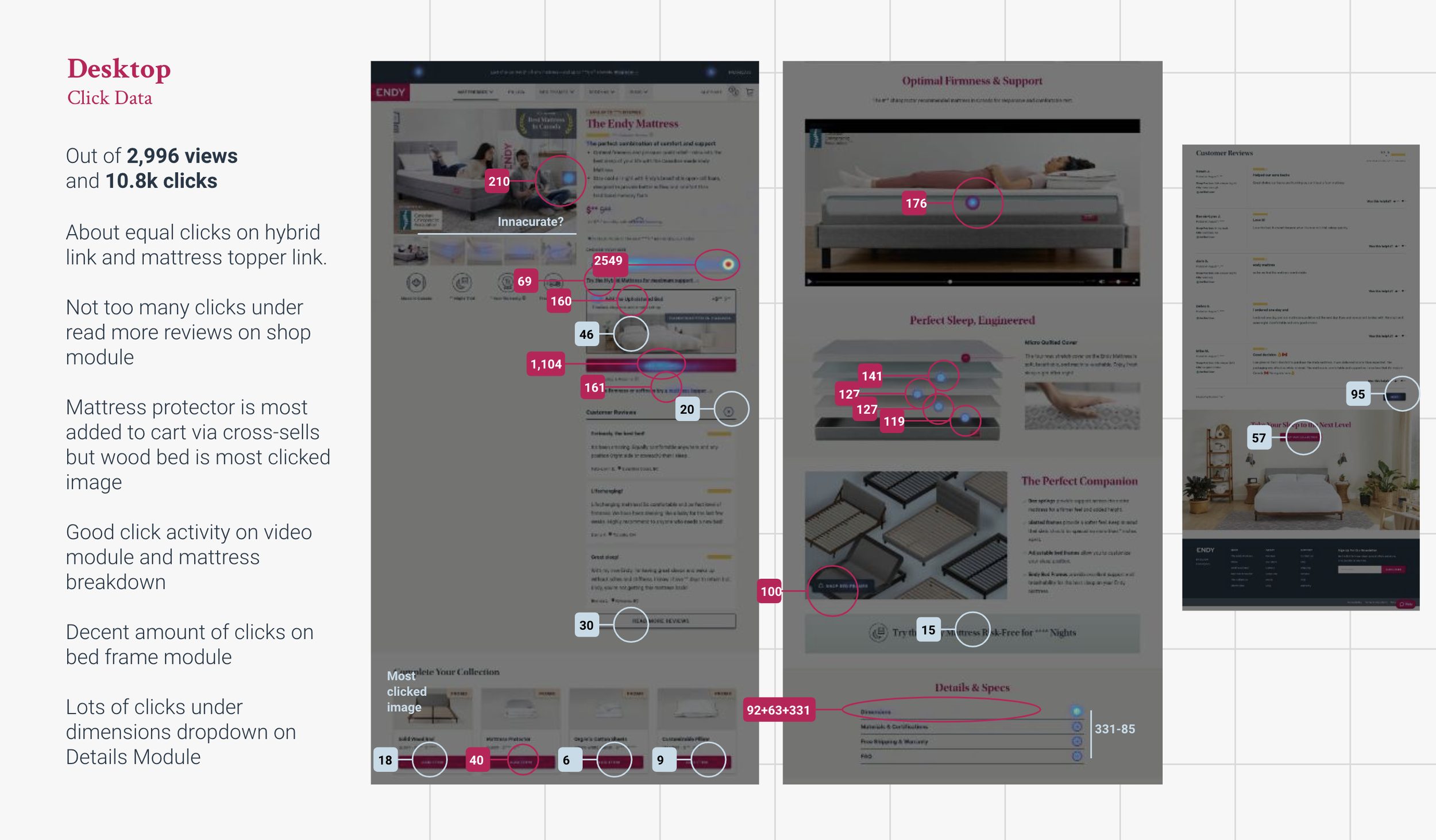
Heatmaps and Google Analytics
Wireframing ideation
UI proposal and Implementation
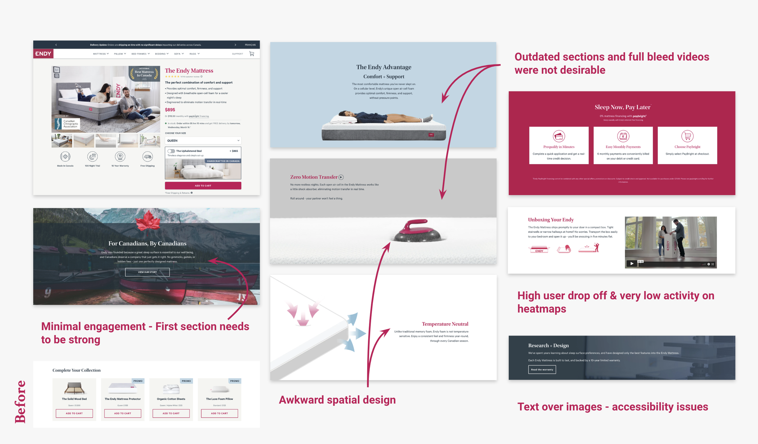
Current Problems and Areas of Improvement
By leveraging our data, we gain insights into user interactions with page elements, enabling us to pinpoint areas of friction.
Lack of engagement with the product cross-sells.
Users closing the reviews section rather than clicking ‘Read more’.
Request to boost visibility of financing options to boost conversion.
How can we update this design to encourage users to increase basket size?
Heatmaps & Analytics
Data was gathered by using a combination of Google Analytics and a heatmap tool to understand traffic on the website. By analyzing this data, it was possible to identify user flows and provide insights to our design decisions . Additionally, the data helped to identify areas of the website that needed rework, as well as identify any potential issues that were causing users to leave the site. The findings from the heatmap data were then used to make improvements to the website, including changes to the layout and design, in order to optimize the user experience and increase conversions.
Key Findings
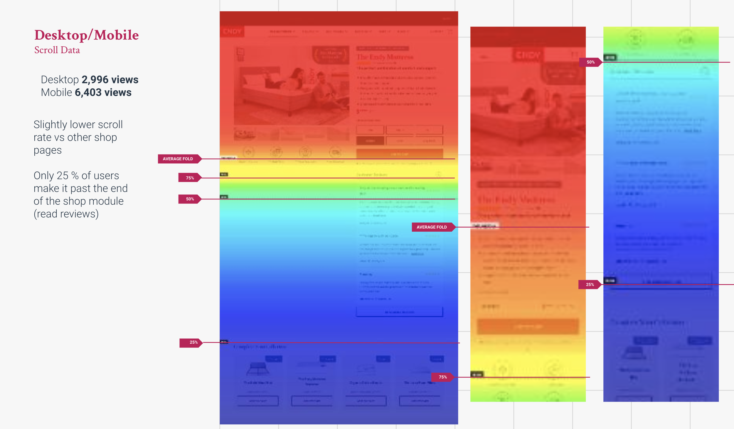
Our heatmap analysis revealed a common pain point of repetitive clicking between the mattress learner page (MLP) and the mattress shop page. Additionally, the heatmaps showed minimal engagement below the fold on the shop page, indicating a lack of interest in the content and little value to be gained from it. On the other hand, we noticed very high activity on key sections of our learner page, suggesting that this information should be included on the shop page as well.
Hotjar was used to collect heatmap data on high traffic product pages in order to gain a deeper understanding of how users interact with those pages. The heatmap data collected included information on user clicks, cursor movements, and scrolling behavior.
Wireframing
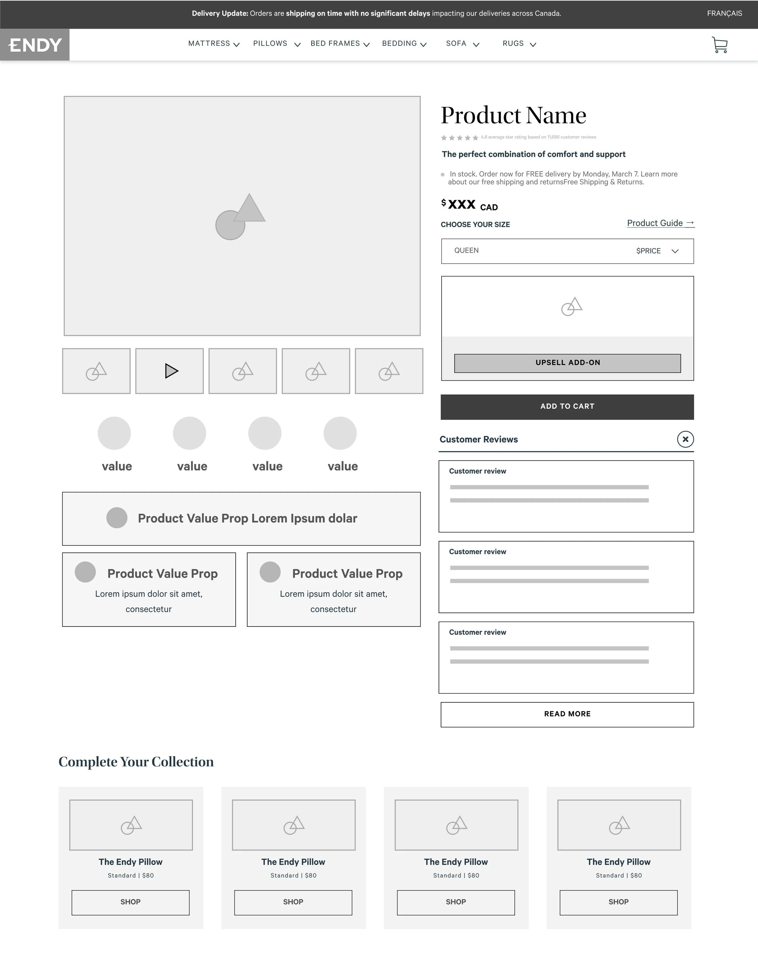
After analyzing our research and internal data from the website, several wireframe iterations lead to our team to proceed with a solution that would satisfy our discovered pain points and best practices.
Shop Section - Lean towards a less text heavy layout and allow product photography to lead conversions while highlighting awards and product certifications. Utilize space below carousel for value proposition content.
Data revealed strong click areas that could be moved above fold to increase discovery and simplify the user experience during their shop.
Size information is critical to have where users expect to find - In this case beside the size selector and is now a dropdown (better for mobile).
Goals below Shop Section- Provide our shoppers clear visuals to the technology ‘inside’ the mattress. Strong evidence reveals users gain confidence and trust in products when we sell technology as a key term vs just a product
Utilize 3D to preview mattress layers so that users can understand each piece of technology or layer and its role for better sleep.
Solve commonly asked questions - All e-comm spaces have different pain points and we wanted to directly answer these on the shop page.
UI Implementation
This project was completed within an agile environment, working in sprints. After the developers coded the pages, we had to conduct quality assurance on the design. Some elements were not implemented in the first build as this page was part of a larger scope of rebuilding the endy site. Therefore, we had to set a plan to implement new sections and elements in phases. This approach allowed us to ensure a smooth and organized process while also taking into consideration the larger project goals.
Previous Design
New UI Design
Testing and Learnings
Immediately after rolling out the new page designs, we set up heat maps and closely monitored user activity with specific goals and questions in mind. We were interested in understanding the impact of the changes on conversions, the proportion of users who scrolled below the fold compared to the previous design, and whether the level of engagement and bounce rate had improved. None the less, there were successful changes and some new insights which we can take action on for the next iteration.
Improving Conversion
The shop module deemed to be needing the most attention and with the changes made, we have effectively increased conversion and basket size.
Redesigned the shop section to be less text heavy above the fold increased scroll rate
Put extra UI attention on payment options to encourage users to add to cart
Consolidated our previous cross sell UI so its easier to add which increased overall adds to basket
Incorporated shipping Estimated Time of Arrival (ETA) to enhance user-centered value and delight.
Sale Hero Redesigns
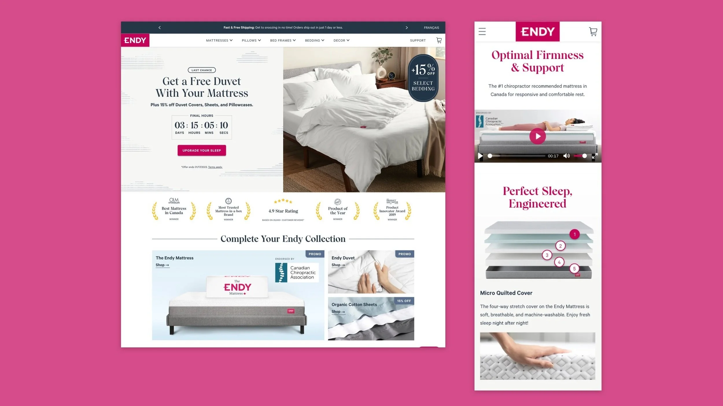
As a member of an e-commerce company, it is essential to recognize the importance of a prominent hero banner for driving sales. At Endy, this task was particularly crucial for increasing conversions.
Research trends & best practices
Solution must be accessible and responsive-friendly
Create new sale templates so team can plug and play with imagery and messaging
Previous State
Move away from two floating images for homepage as it gets very tight on small screens
Image and texts components sometimes land over faces and product imagery
Terms and condition fine print not accessible and often obstructs visuals on mobile with its length
Need to optimize image exports for responsive design
Pain points and constraints
Research & Design Thinking
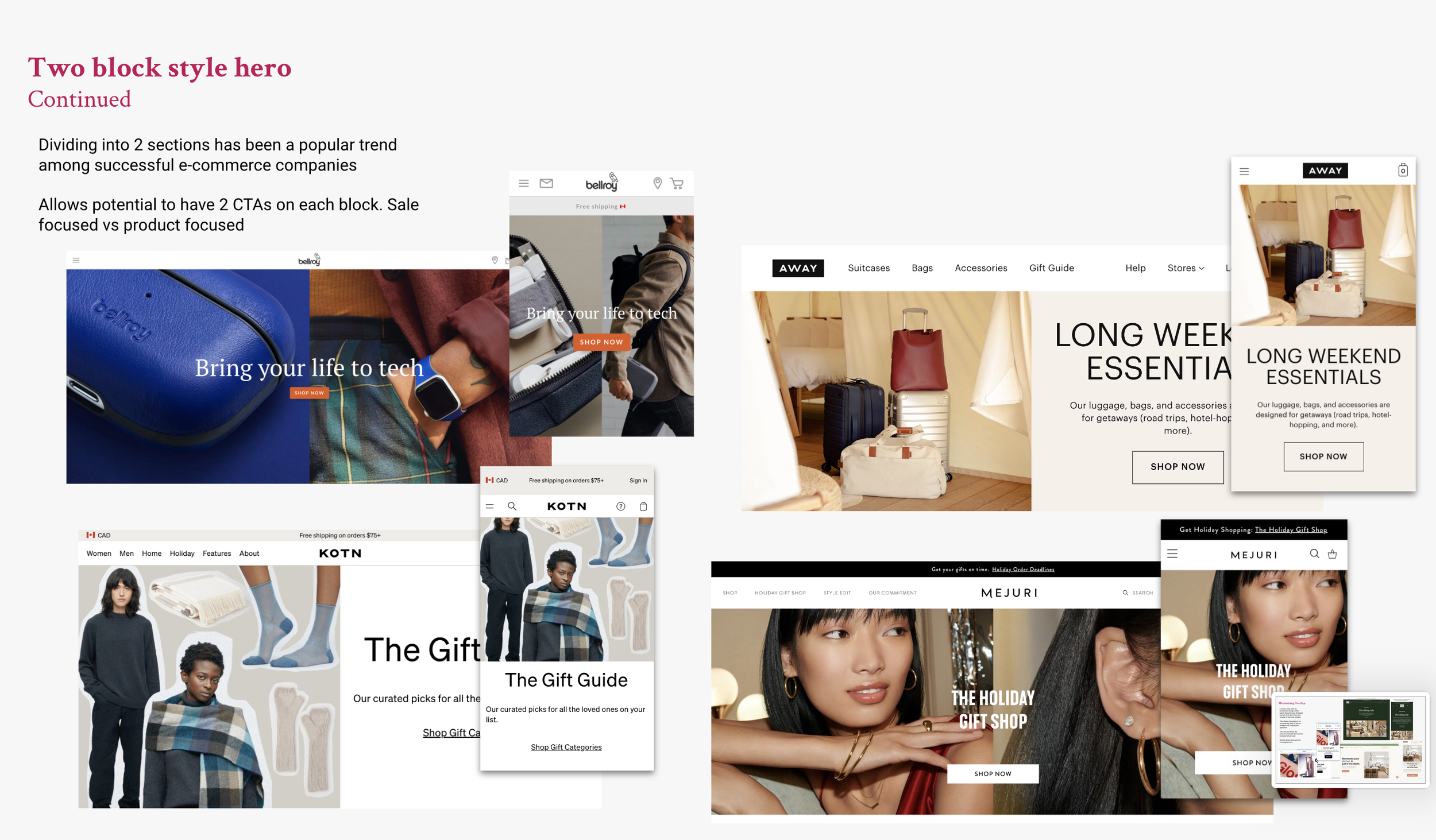
Recent research has shown that utilizing a responsive hero approach can greatly enhance the user experience on a website. This approach allows the hero banner to adapt to the size and resolution of the viewer's device, resulting in a more visually pleasing and easily navigable interface.
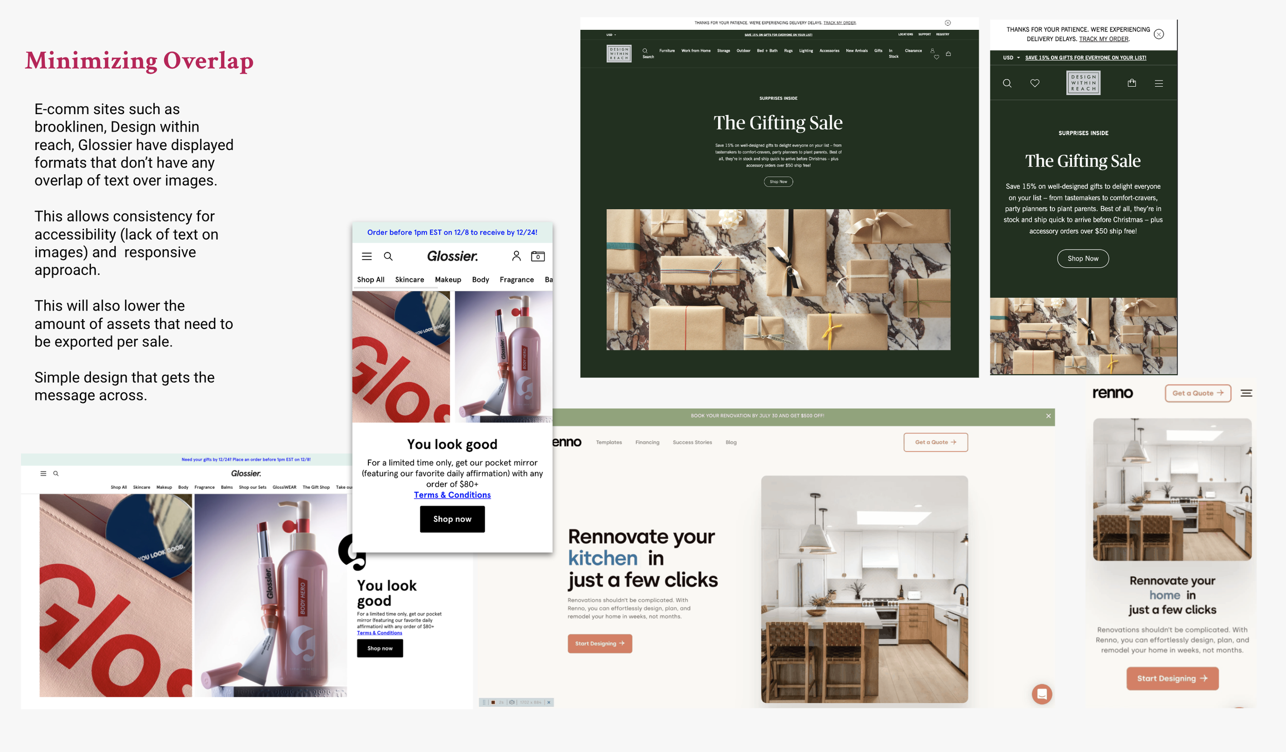
Additionally, a minimalistic hero design has been found to be highly effective in capturing the viewer's attention and delivering a clear message. By eliminating unnecessary elements and focusing on the essentials, a minimalistic hero banner can effectively communicate the company's value proposition and call-to-action.
Another key finding is the importance of avoiding text overlap on images in the hero banner. When text is superimposed on an image, it can make the banner appear cluttered and make it harder for viewers to read the message. Instead, it is recommended to have the text on a contrasting background or in a separate section to maintain legibility.
Lastly, research has shown that reducing the number of asset exports can lead to faster loading times and improved website performance. By optimizing image sizes and compressing files, website owners can ensure that the hero banner is loaded quickly and seamlessly, improving the overall user experience.
Responsive Design
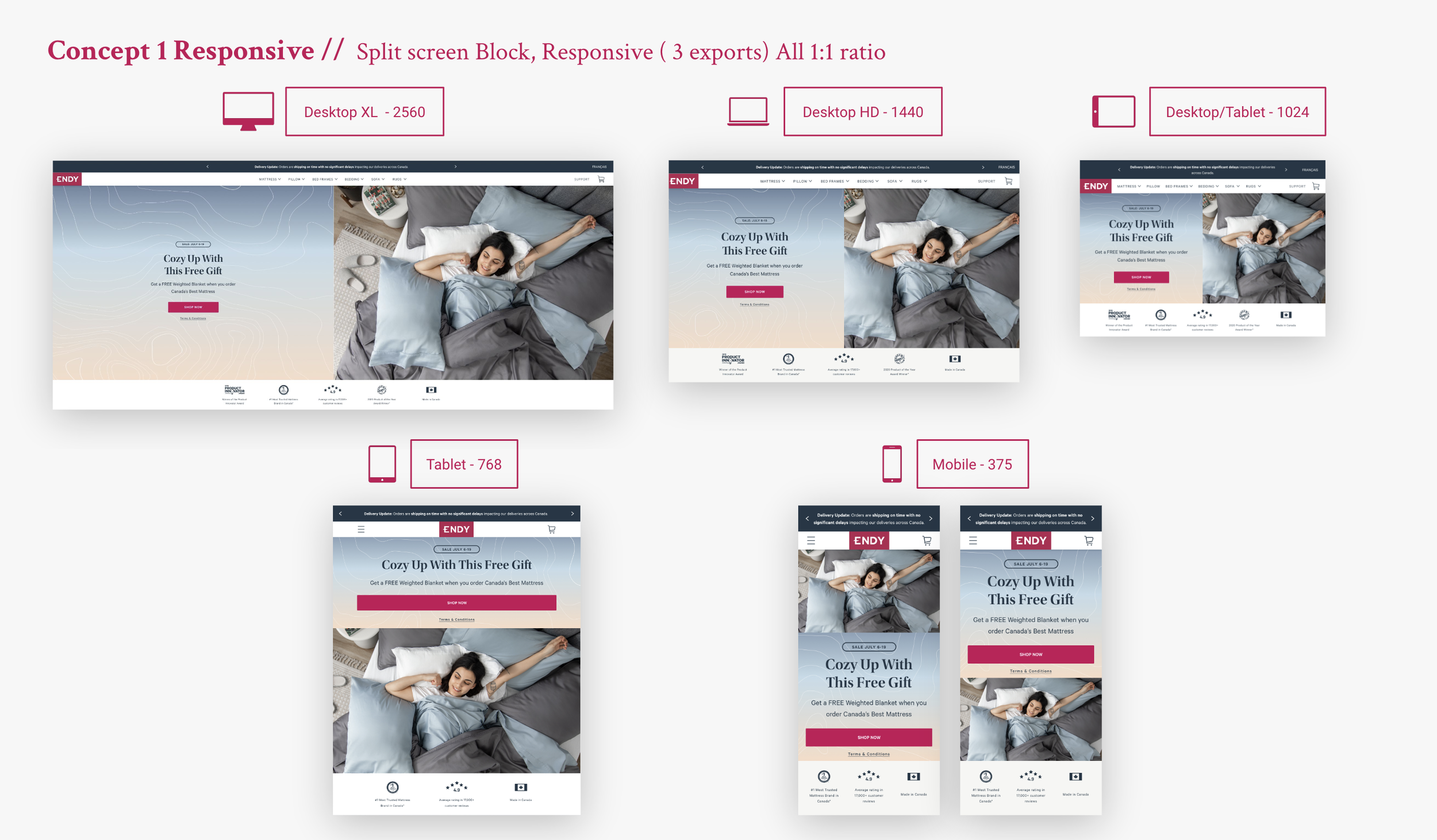
Improving responsive design for creating sale heroes was an important step in streamlining our process. By focusing on responsive design, we were able to ensure that our sale hero designs would look great and be easy to use on any device, including smartphones, tablets, and desktop computers. Additionally, we were able to ensure that our sale heroes were highly visible and easy to use, which helped to increase conversions and drive more sales
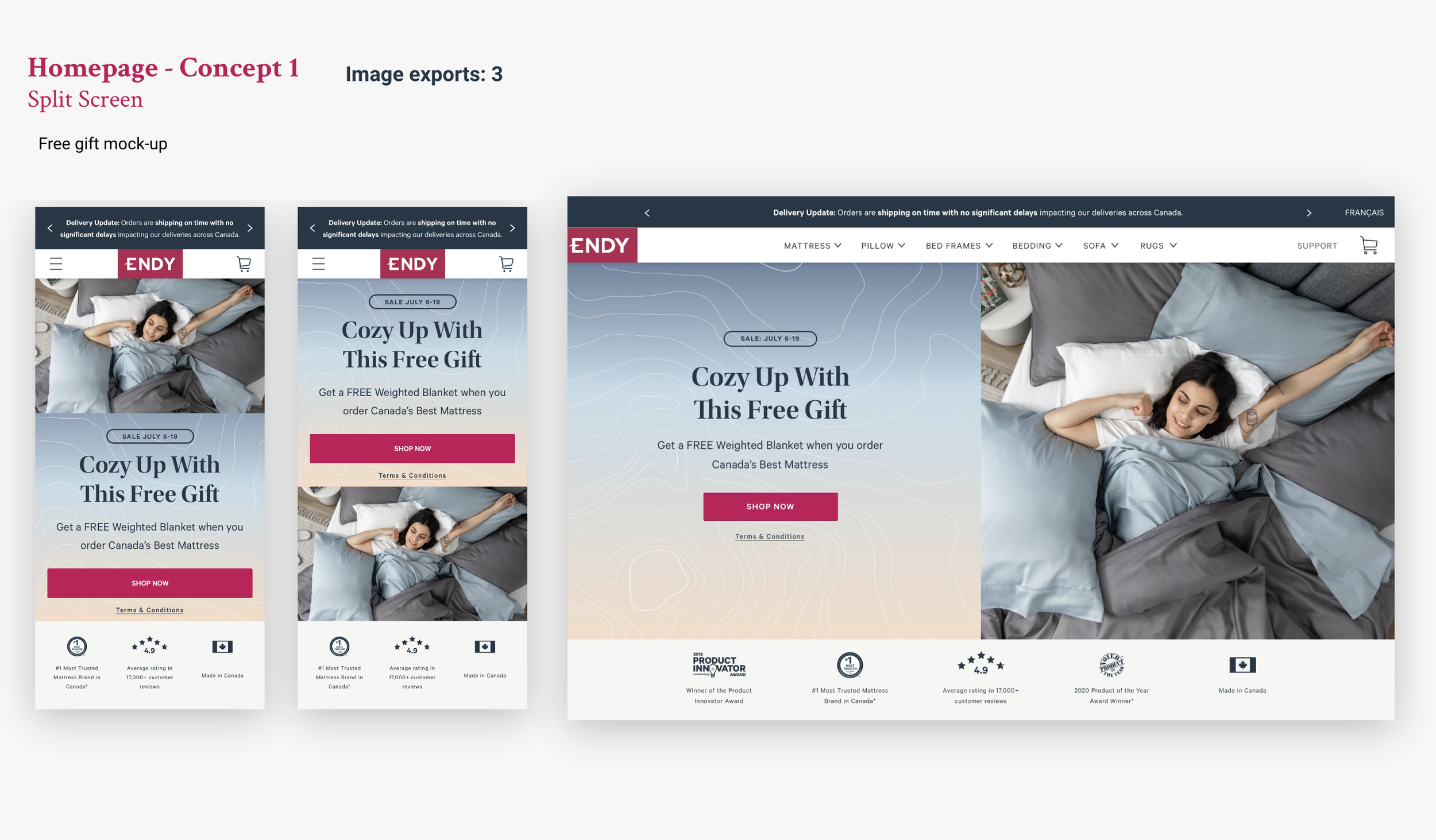
Concept 1
The split-screen layout solution was approved as it aligned with our brand and creative direction, and was influenced by successful e-commerce brands that have implemented a similar layout. This design approach allows for image assets and messaging to be separated in distinct containers, ensuring accessibility guidelines and best practices are met, while also fulfilling the requirements of the project brief.
Concept 2
The hero design was focused on minimalism, with the goal of making the photography the central highlight. The copy was arranged vertically above the image, without interfering with the layout. Additionally, this design was highly responsive, as our team only needed to export one asset for all viewports, thanks to the consistent image ratio. This helped to address some of the challenges in development hand-off.
Default Hero
Our goal was to optimize the default state of our homepage, even when not on sale. We aimed to drive traffic to our highest performing pages, such as the mattress page and the mattress learner page. To achieve this, we wanted to explore ways to have these elements prominently displayed "above the fold" (i.e. visible on all screen sizes without scrolling) to increase user interaction.
These projects are just a sample of the tasks that I was directly involved in to help improve the endy web experience for customers. If you have any questions about certain areas or want to learn more, please feel free to reach out to me.
Thanks!
